There are apps that are not popular at all with people over 30. Snapchat is a great example.
Of course, there is nothing inherent in the app that prevents people over 30 from using it, but the way Snapchat is navigated differs a lot from the familiar logic of platforms such as WhatsApp and Facebook. Instead of clicks, there is more focus on swiping techniques. This takes some getting used to.
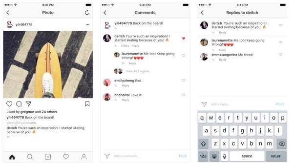
Instagram layout: disordered comments
Instagram, a constant Snapchat competitor, looks quite different. The picture network is similar to Snapchat in look and feel, but it only takes minutes to get the hang of using it.
Therefore, its not so much its functionality, but its in-app navigation that has given Instagram a leg-up on its competitor Snapchat.
There is actually only one place in the Instagram universe where chaos wins over order – and that is in terms of comments. So far, commenting in Instagram has suffered from a great problem: its lack of order.
Anyone who responds to a comment and makes a comment by replying addresses his message directly to the respective user – but this is not always clear.
Unlike Facebook, Instagram has so far displayed all comments right below each other. Not anymore.

In a blog post, the picture network has now indicated that future replies to comments will be indented. In addition, Instagrammers are given the option of tracking a single comment thread on their screen.
The new layout of the comments section will be rolled out in Instagram version 24. This will be made available to Apple and Android users in the coming weeks and will provide more order.


